Useful / Beautiful
Harewood House
March - October 2019
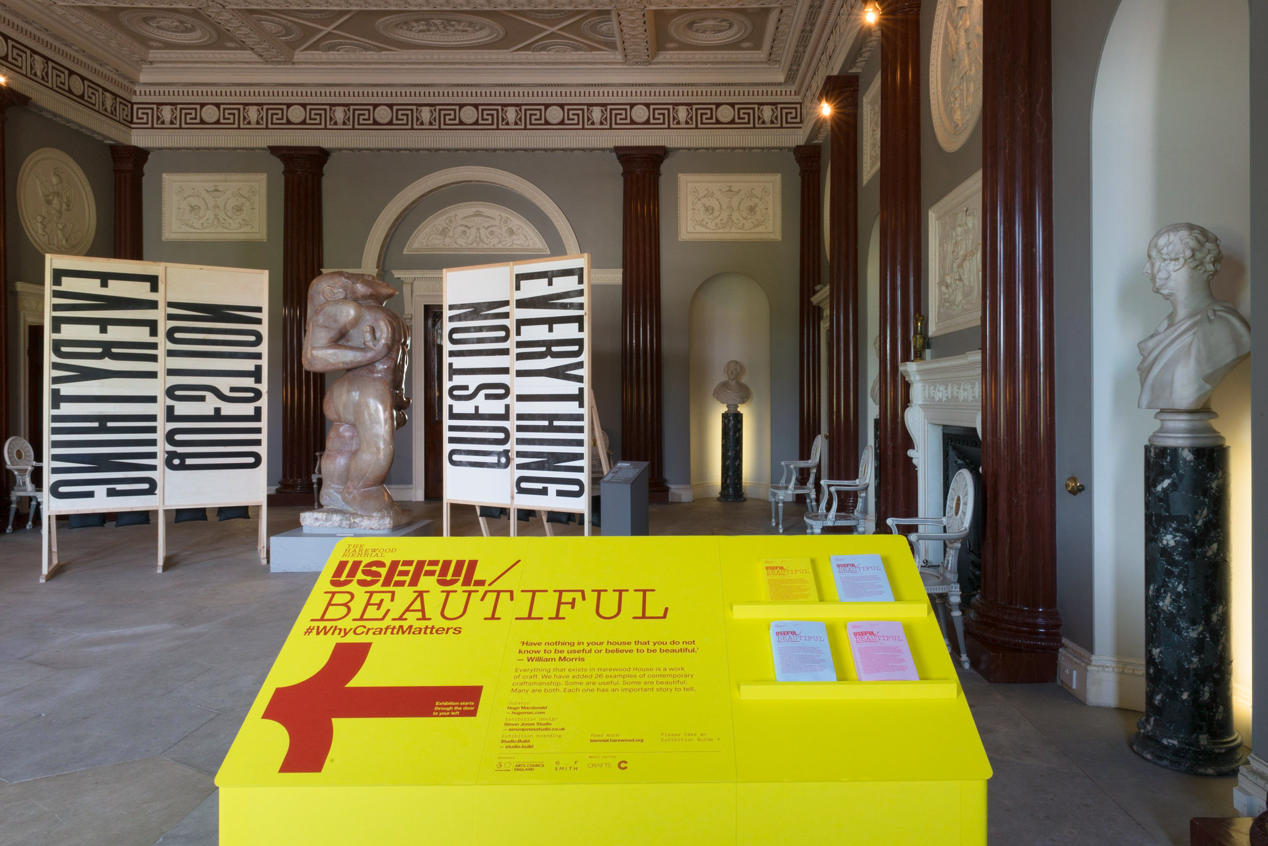
We were commissioned to design, fabricate and install the first in a new series of Biennial exhibitions at Harewood House, called Useful/Beautiful (Why Craft Matters). Curated by Hugo Macdonald, the work of 26 contemporary designers from across the UK was showcased throughout the magnificent and varied rooms of this stately home near Leeds.
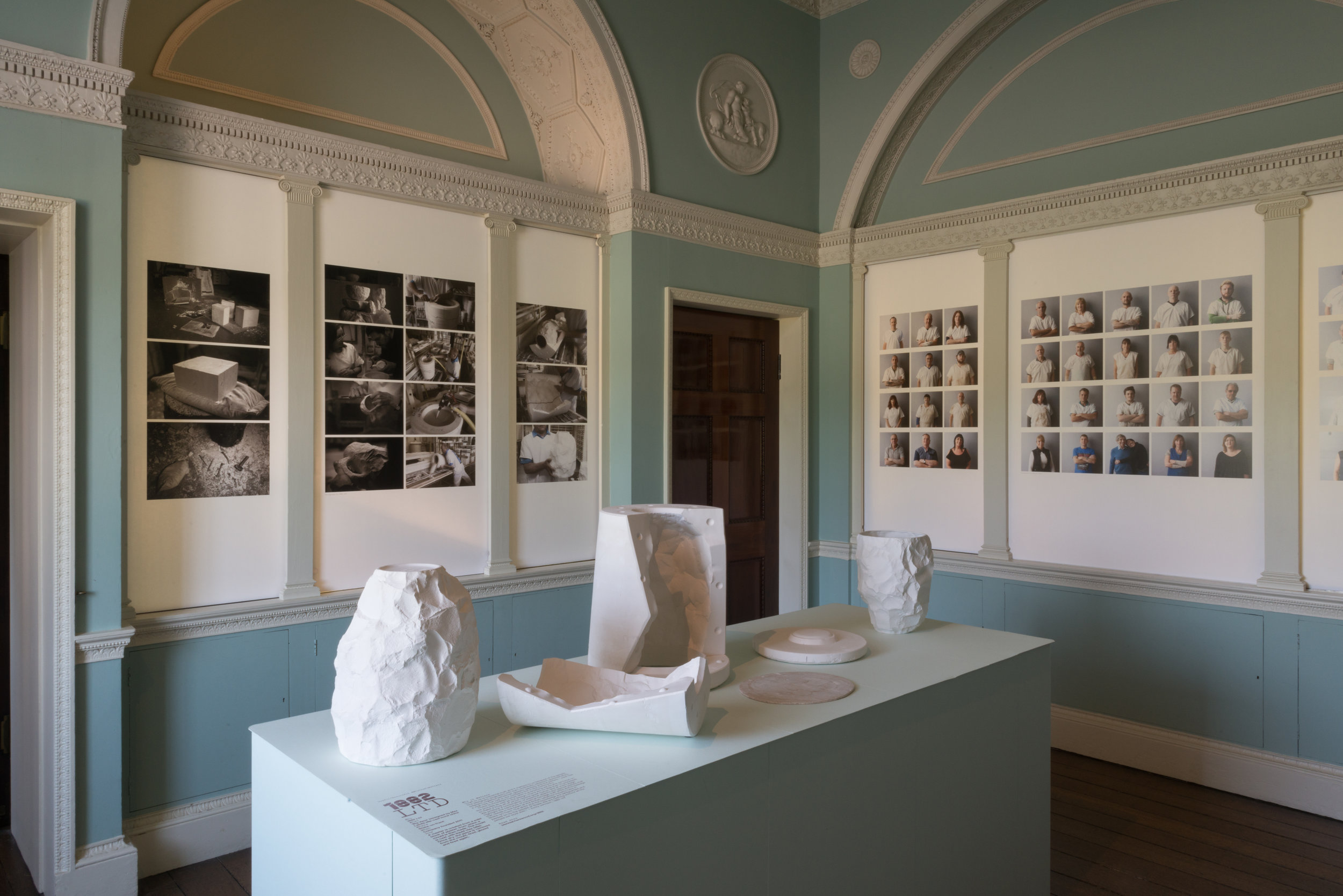
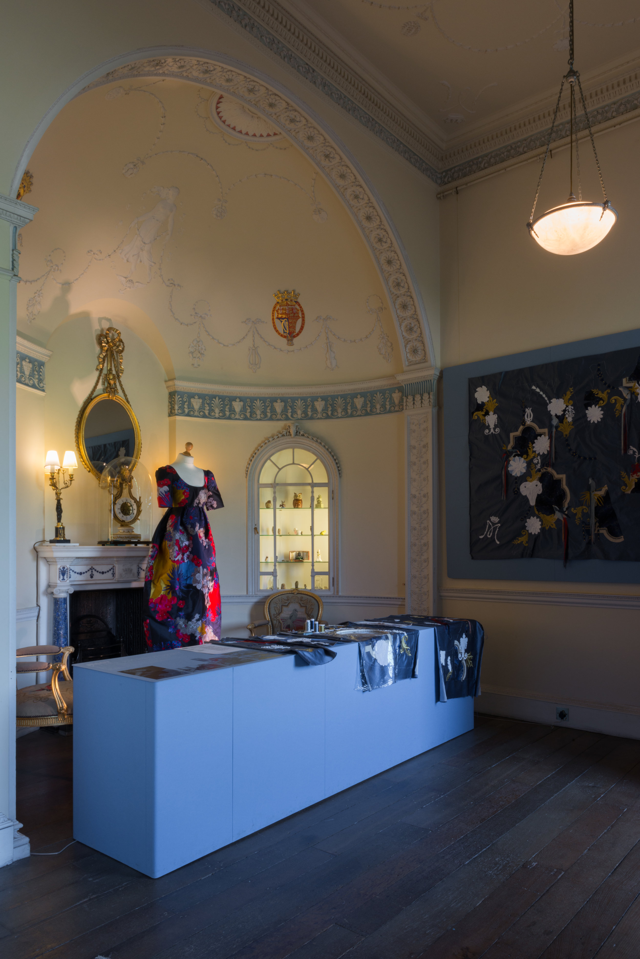
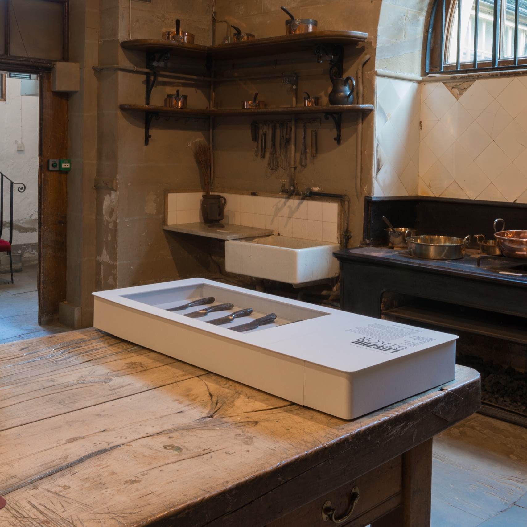
The task of how to display the exhibits in rooms already commanding the visitors attention and often filled with intriguing and objects and artworks already, was approached using coloured plinths and backdrops to highlight exhibits in each space. Hull based paper company G.F. Smith kindly supported the exhibition through provision of it’s Colourplan paper, which we then used to build all the display furniture and interpretation stands.
We selected a different paper colour for each of the 26 designers and carefully played these against the existing colours with the rooms and Robert Adam’s wonderful ceilings.
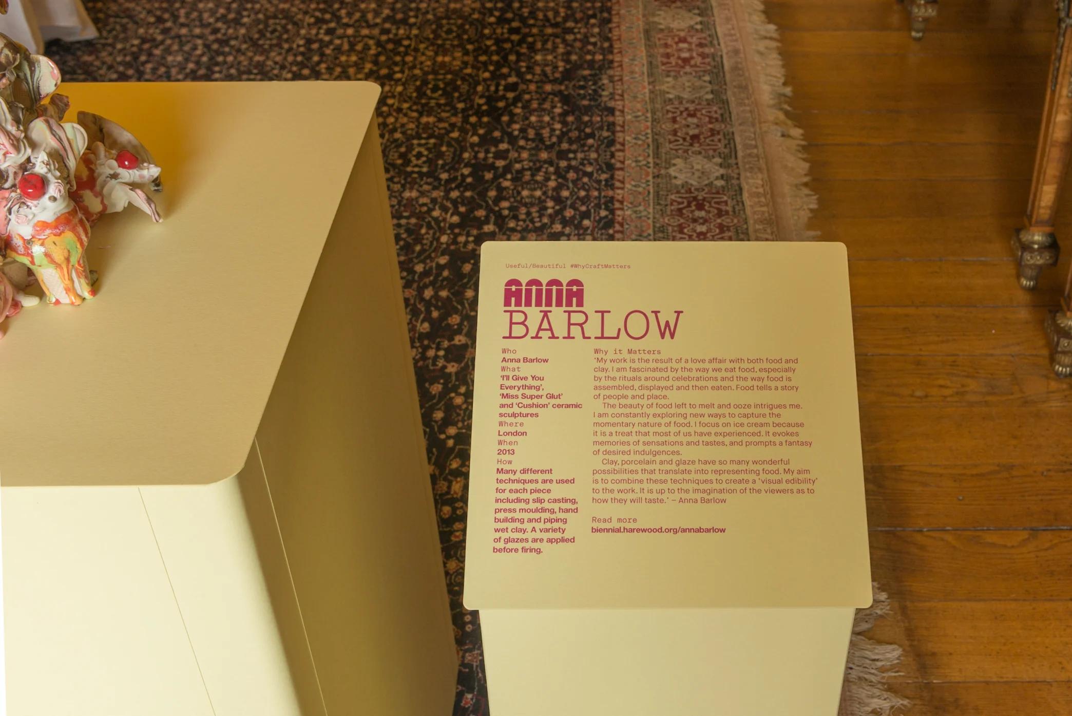
Various weights of paper were used to meticulously wrap plinths and cover panels. Thicker duplexed paper sheets were used for the plinth tops and interpretation panels beside exhibits, deliberately expressing the thinness and texture of the Colourplan paper sheets.
Graphic designers Studio Build created specially designed typefaces for the exhibition interpretation and used contrasting coloured type on the various coloured papers, often directly on to the plinth surfaces and panels to create integrated and coherent text content.
Photos by Simon Jones Studio


